
"Widely considered the official typeface of the twentieth century, Helvetica communicates with simple, well-proportioned letterforms that convey an aesthetic clarity that is at once universal, neutral, and undeniably modern." Exhibit on Helvetica opens tomorrow at the MoMA.
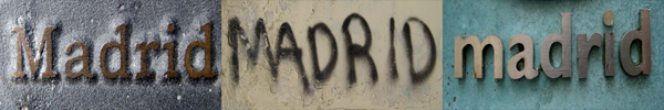
Update: The Metro system in Madrid uses Helvetica on the station signs. However, the bold weight of Helvetica "a" doesn't have the tail, so it's mildly confusing. Following another lead, the shape of the letter "t", I found out that the signs on the station entrance door were in Arial. What a fucking inconsistency!

No comments:
Post a Comment